本文转自: https://voussoir.net/writing/css_for_printing
仅做个人收藏,版权归原作者所有
CSS for printing to paper
- Table of contents
- Introduction
- Sample files
- @page
- @media print
- Width, height, margin, and padding
- Element positioning
- Multi-page documents with repeating elements
- Portrait / Landscape mode
- Data source
- Essentials cheatsheet
Introduction (§)
At work, one of the things I do pretty often is write print generators in HTML to recreate and replace forms that the company has traditionally done handwritten on paper or in Excel. This allows the company to move into new web-based tools where the form is autofilled by URL parameters from our database, while getting the same physical output everyone’s familiar with.
This article explains some of the CSS basics that control how your webpages look when printed, and a couple of tips and tricks I’ve learned that might help you out.
Sample files (§)
Here are some sample page generators to establish some context, and perhaps a shred of credibility.
I’ll be the first to admit these pages are a little bit ugly and could use more polish. But they get the job done and I’m still employed.
Coversheet with sidebar inputs
Coversheet with contenteditable
@page (§)
CSS has a rule called @page that informs the browser of your website’s printing preferences. Normally, I use
@page
{
    size: Letter portrait;
    margin: 0;
}
I will explain why I choose margin: 0 in the later section about margins. You should use Letter or A4 as appropriate for your relationship with the metric system.
Setting the size and margin of @page is not the same as setting the width, height, and margin of your <html> or <body> element. @page is beyond the DOM — it contains the DOM. On the web, your <html> element is bounded by the edges of your screen, but when printing it is bounded by @page.
The settings controlled by @page more or less correspond to the settings you get in your browser’s print dialog when you press Ctrl+P.
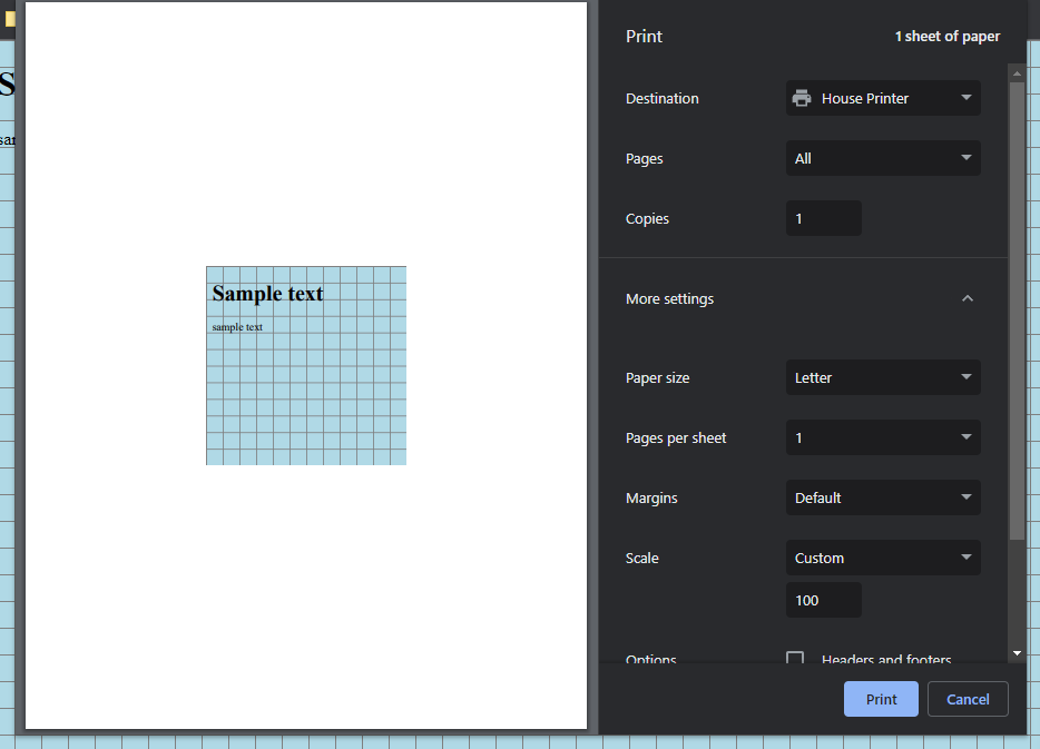
Here’s a sample file I used to do some experiments:
<!DOCTYPE html>
<html>
<style>
@page
{
    /* see below for each experiment */
}
html
{
    width: 100%;
    height: 100%;
    background-color: lightblue;

    /* grid by shunryu111 https://stackoverflow.com/a/32861765/5430534 */
    background-size: 0.25in 0.25in;
    background-image:
    linear-gradient(to right, gray 1px, transparent 1px),
    linear-gradient(to bottom, gray 1px, transparent 1px);
}
</style>
<body>
    <h1>Sample text</h1>
    <p>sample text</p>
</body>
</html>
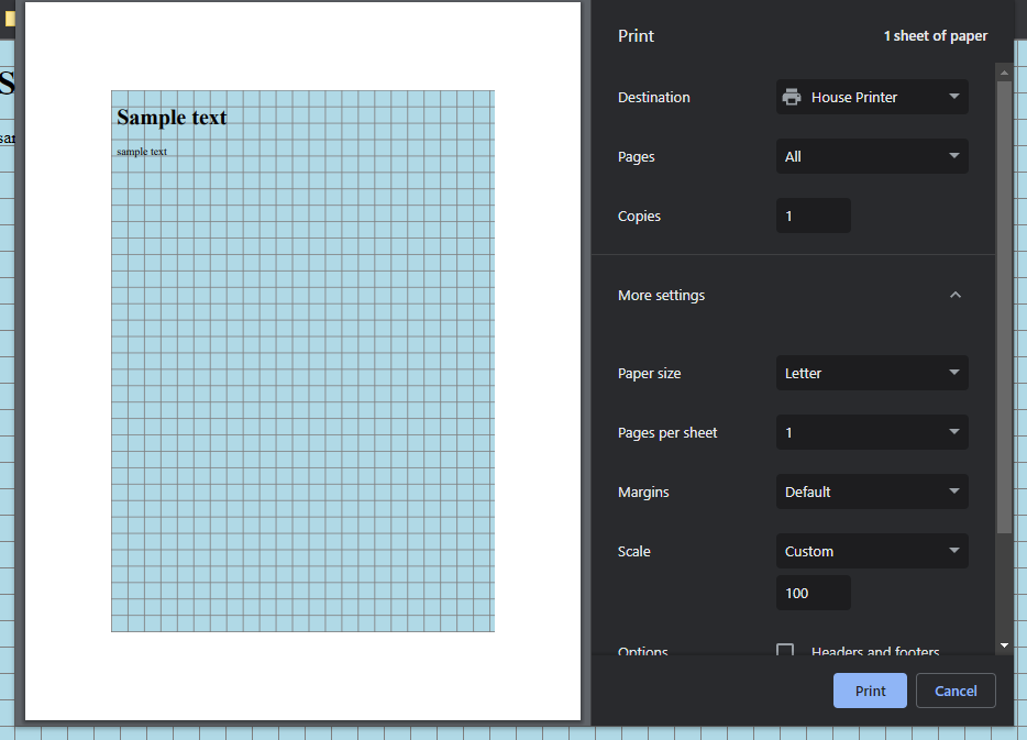
Here’s how that looks in the browser:

And here are the results of some different @page values:
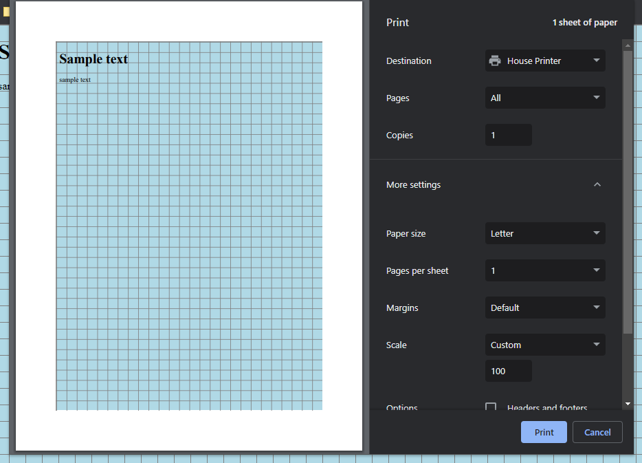
@page { size: Letter portrait; margin: 1in; }:
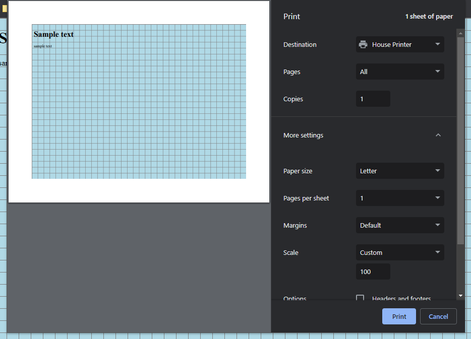
@page { size: Letter landscape; margin: 1in; }:
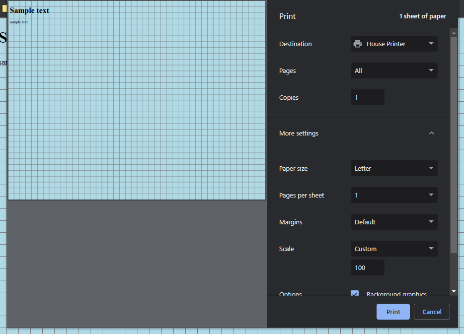
@page { size: Letter landscape; margin: 0; }:
Setting the @page size won’t actually put that size of paper into your printer’s feed tray. You’ll have to do that part yourself.
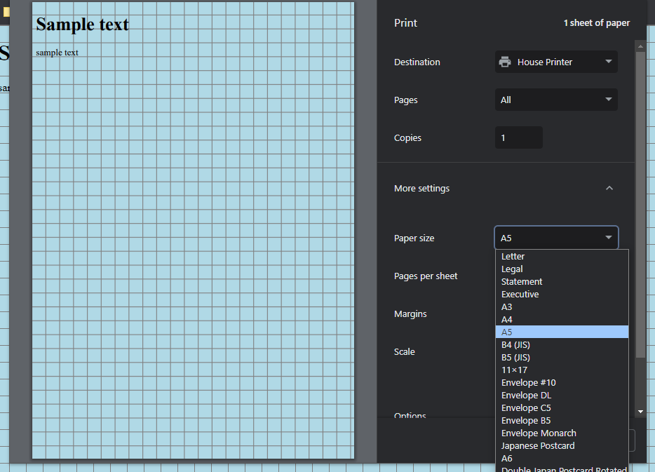
Notice how when I set size to A5, my printer stays on Letter, and the A5 size fits entirely within the Letter size which gives the appearance of a margin even though it’s not coming from the margin setting.
@page { size: A5 portrait; margin: 0; }:
But if I tell the printer that I have actual A5 paper loaded, then it looks as expected.
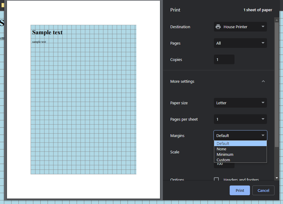
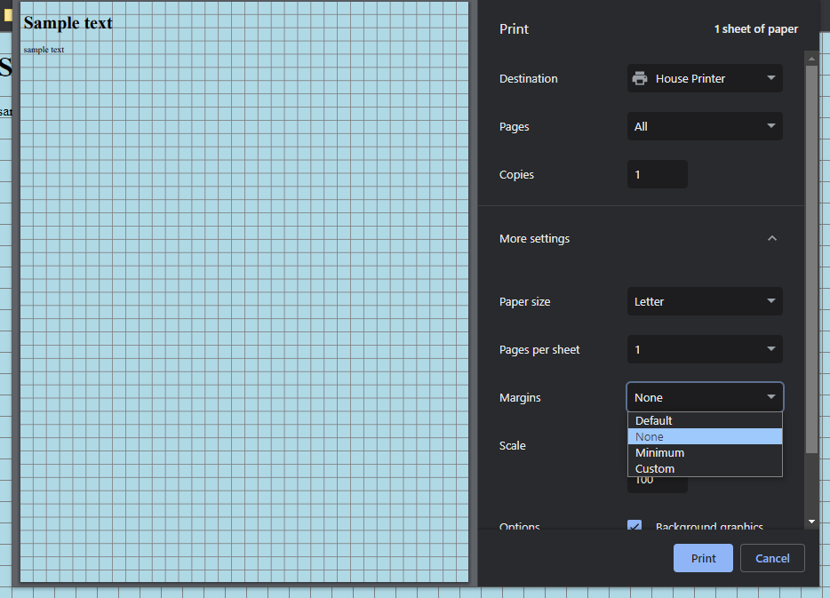
From what I gather by experimentation, Chrome only follows the @page rule if you have Margin set to Default. As soon as you change Margin in the print dialog, your output is instead the product of your physical paper size and the chosen margin.
@page { size: A5 portrait; margin: 0; }:
Even when you choose a @page size that fits fully within your physical paper, the margin still matters. Here, I make a 5×5 square with no margin, and a 5×5 square with margin. The size of the <html> element is bounded by the @page size and margin combined.
@page { size: 5in 5in; margin: 0; }:
@page { size: 5in 5in; margin: 1in; }:
I did all these tests not because I expect to print on A5 or 5×5 paper, but because it took me a while to figure out what exactly @page is. Now I am pretty confident in always using Letter with margin 0.
@media print (§)
There is a media query called print where you can write styles that only apply during printing. My generator pages often contain a header, some options, and some help text for the user that obviously shouldn’t come out on the print, so this is where you add display:none on those elements.
/* Normal styles that appear while you are preparing the document */
header
{
    display: block;
}

@media print
{
    /* Disappear when you are printing the document */
    header
    {
        display: none;
    }
}
Width, height, margin, and padding (§)
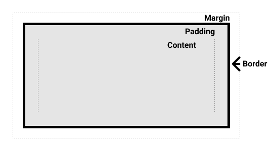
You’ll need to know a bit about the box model to get the margins you want without wrestling the computer too much.
The reason I always set @page margin: 0 is that I’d rather handle the margins on the DOM elements instead. When I tried to use @page margin: 0.5in, I would often accidentally wind up with double-margins that squash the content smaller than I expected, and my one-page design spilled onto a second page.
If I wanted to use @page margin, then the actual page content would need to be laid out all the way up against the edges of the DOM, which is harder for me to think about and harder to preview before printing. It is mentally easier for me to remember that <html> occupies the entire physical paper and my margins are within the DOM instead of beyond it.
@page
{
    size: Letter portrait;
    margin: 0;
}
html,
body
{
    width: 8.5in;
    height: 11in;
}
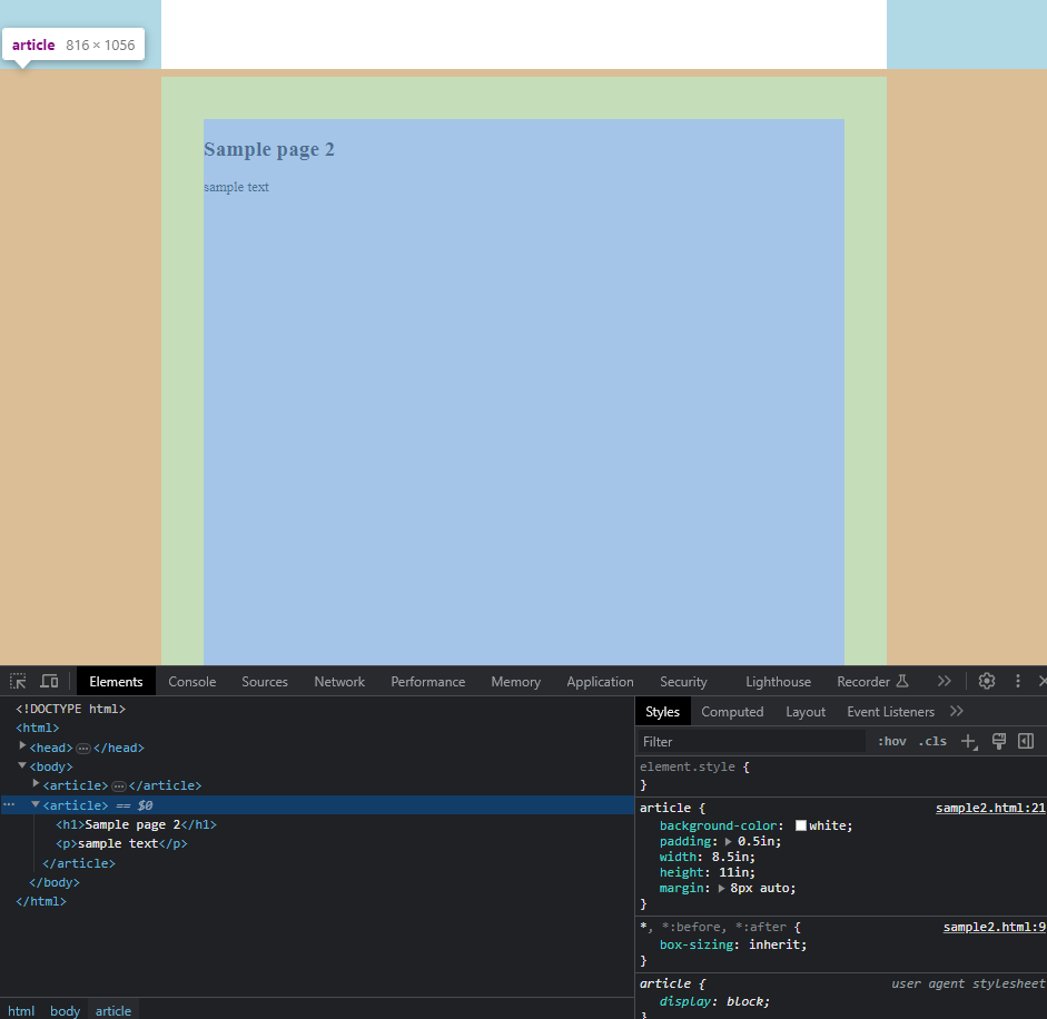
When it comes to multi-page print generators, you’re going to want a separate DOM element representing each page. Since you can’t have multiple <html> or <body>, you’re going to need another element. I like <article>. Even for single-page generators, you may as well always use an article.
Since each <article> represents one page, I don’t want any margins or padding on <html> or <body>. We’re pushing the logic one step further — it is easier for me to let the article occupy the entire physical page and put my margins within it.
@page
{
    size: Letter portrait;
    margin: 0;
}
html,
body
{
    margin: 0;
}

article
{
    width: 8.5in;
    height: 11in;
}
When I talk about adding margin within my article, I’m not using the margin property, I’m using padding. That’s because margin goes outside and around your element in the box model. If you use a margin of 0.5in, you’ll have to set the article to 7.5×10 so that the article plus 2×margin equals 8.5×11. And if you want to adjust that margin you’ll have to adjust the other dimensions.
Instead, padding goes on the inside of the element, so I can define the article to be 8.5×11 with 0.5in padding, and all the elements inside the article will stay on the page.
A lot of intuition about element dimensions is easier when you set box-sizing: border-box. It makes it so that the outer dimensions of the article are locked in while you adjust the inner padding. This is my snippet:
html
{
    box-sizing: border-box;
}
*, *:before, *:after
{
    box-sizing: inherit;
}
Let’s put this all together:
@page
{
    size: Letter portrait;
    margin: 0;
}

html
{
    box-sizing: border-box;
}
*, *:before, *:after
{
    box-sizing: inherit;
}

html,
body
{
    margin: 0;
}

article
{
    width: 8.5in;
    height: 11in;
    padding: 0.5in;
}
Element positioning (§)
Once you’ve got your articles and margins set up, the space inside the article is yours to do with as you please. Design your document using whatever HTML/CSS you feel is appropriate for the project. Sometimes this means laying out elements with flex or grid because you’ve been given some leeway with the output. Sometimes it means creating squares of a specific size to fit on a certain brand of sticker paper. Sometimes it means absolutely positioning absolutely everything to the millimeter because the user needs to feed a special piece of pre-labeled paper through the printer to get your data on top of it, and you’re not in control of that special paper.
I’m not here to give a tutorial on how to write HTML in general, so you’ll need to be able to do that. All I can say is be mindful of that fact that you’re dealing with the limited real estate of a piece of paper, unlike a browser window which can scroll and zoom to any length or scale. If your document will contain an arbitrary number of items, be ready to paginate by creating more <article>.
Multi-page documents with repeating elements (§)
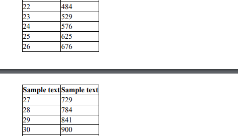
A lot of the print generators I write contain tabular data, like an invoice full of line items. If your <table> is large enough to go onto a second page, the browser will automatically duplicate the <thead> at the top of each page.
<table>
    <thead>
        <tr>
            <th>Sample text</th>
            <th>Sample text</th>
        </tr>
    </thead>
    <tbody>
        <tr><td>0</td><td>0</td></tr>
        <tr><td>1</td><td>1</td></tr>
        <tr><td>2</td><td>4</td></tr>
        ...
    </tbody>
</table>
That’s great if you’re just printing a <table> with no frills, but in a lot of real scenarios it’s not that simple. The document I’m recreating often has a letterhead on the top of each page, a footer on the bottom, and other custom elements that need to be explicitly repeated on each page. If you just print a single long table across pages, you don’t have much ability to place other elements above, below, and around it on intermediate pages.
So, I generate the pages using javascript, splitting the table into several smaller ones. The general approach here is this:
- Treat the
<article>elements as disposable and be ready to regenerate them at any time from objects in memory. All user input and configuration should take place in a separate header / options box, outside of the articles. - Write a function called
new_pagethat creates a new article element with the necessary repeating header/footer/etc. - Write a function called
render_pagesthat creates the articles from the base data, callingnew_pageevery time it fills up the previous one. I usually useoffsetTopto see when the content is getting far along the page, though you could definitely use smarter techniques to get the perfect fit on each page. - Call
render_pageswhenever the base data changes.
function delete_articles()
{
    for (const article of Array.from(document.getElementsByTagName("article")))
    {
        document.body.removeChild(article);
    }
}

function new_page()
{
    const article = document.createElement("article");
    article.innerHTML = `
    <header>...</header>
    <table>...</table>
    <footer>...</footer>
    `;
    document.body.append(article);
    return article;
}

function render_pages()
{
    delete_articles();

    let page = new_page();
    let tbody = page.query("table tbody");
    for (const line_item of line_items)
    {
        // I usually pick this threshold by experimentation but you can probably
        // do something more rigorously correct.
        if (tbody.offsetTop + tbody.offsetParent.offsetTop > 900)
        {
            page = new_page();
            tbody = page.query("table tbody");
        }
        const tr = document.createElement("tr");
        tbody.append(tr);
        // ...
    }
}
It is usually good to include a “page X of Y” counter on your pages. Since the number of pages is not known until all pages are generated, I can’t do this during the for loop. I call a function like this at the end:
function renumber_pages()
{
    let pagenumber = 1;
    const pages = document.getElementsByTagName("article");
    for (const page of pages)
    {
        page.querySelector(".pagenumber").innerText = pagenumber;
        page.querySelector(".totalpages").innerText = pages.length;
        pagenumber += 1;
    }
}
Portrait / Landscape mode (§)
I’ve shown that the @page rule helps inform the browser’s default print settings, but the user can override it if they want to. If you set @page to portrait mode and the user overrides it to landscape mode, your layout and pagination might look wrong, especially if you are hardcoding any page thresholds.
You can accommodate them by creating separate <style> elements for portrait and landscape, and using javascript to switch between them. There might be a better way to do this, but at-rules like @page behave differently than normal CSS properties so I’m not sure. You should also save some variable that can help your render_pages function do the right thing.
You could also stop hardcoding thresholds, but then I’d have to follow my own advice.
<select onchange="return page_orientation_onchange(event);">
    <option selected>Portrait</option>
    <option>Landscape</option>
</select>
<style id="style_portrait" media="all">
@page
{
    size: Letter portrait;
    margin: 0;
}
article
{
    width: 8.5in;
    height: 11in;
}
</style>

<style id="style_landscape" media="not all">
@page
{
    size: Letter landscape;
    margin: 0;
}
article
{
    width: 11in;
    height: 8.5in;
}
</style>
let print_orientation = "portrait";

function page_orientation_onchange(event)
{
    print_orientation = event.target.value.toLocaleLowerCase();
    if (print_orientation == "portrait")
    {
        document.getElementById("style_portrait").setAttribute("media", "all");
        document.getElementById("style_landscape").setAttribute("media", "not all");
    }
    if (print_orientation == "landscape")
    {
        document.getElementById("style_landscape").setAttribute("media", "all");
        document.getElementById("style_portrait").setAttribute("media", "not all");
    }
    render_printpages();
}

function render_printpages()
{
    if (print_orientation == "portrait")
    {
        // ...
    }
    else
    {
        // ...
    }
}
Data source (§)
There are a couple of ways to get your data onto the page. Sometimes, I pack all of the data into the URL parameters, so the javascript just does const url_params = new URLSearchParams(window.location.search); and then a bunch of url_params.get("title"). This has some advantages:
- The page loads very fast.
- It’s easy to debug and experiment by changing the URL.
- The generator works offline.
This also has some disadvantages:
- The URLs become very long and unweildy, people cannot comfortably email them to each other. See sample links at the top of this article.
- If the URL does get sent in an email, that data is “locked in”, even if the source record in your database changes later.
- Browsers do have limits on URL length. The limits are pretty high but not infinite and might vary per client.
Sometimes I instead use javascript to fetch our database records over the API, so the URL parameters just contain the record’s primary key and maybe a mode setting.
This has some advantages:
- The URLs are much shorter.
- The data is always fresh.
and disadvantages:
- The user has to wait a second while the data is being fetched.
- You have to write more code.
Sometimes I set contenteditable on the articles so the user can make small changes before printing. I also like to use real, live checkbox inputs they can click before printing. These features add some convenience, but in most cases it would be wiser to make the user change the source record in the database first. Also, they limit your ability to treat the article elements as disposable.
Essentials cheatsheet (§)
<!DOCTYPE html>
<html>
<style>
@page
{
    size: Letter portrait;
    margin: 0;
}
html
{
    box-sizing: border-box;
}
*, *:before, *:after
{
    box-sizing: inherit;
}

html,
body
{
    margin: 0;
    background-color: lightblue;
}

header
{
    background-color: white;
    max-width: 8.5in;
    margin: 8px auto;
    padding: 8px;
}

article
{
    background-color: white;
    padding: 0.5in;
    width: 8.5in;
    height: 11in;

    /* For centering the page on the screen during preparation */
    margin: 8px auto;
}

@media print
{
    html,
    body
    {
        background-color: white !important;
    }
    body > header
    {
        display: none;
    }
    article
    {
        margin: 0 !important;
    }
}
</style>

<body>
    <header>
        <p>Some help text to explain the purpose of this generator.</p>
        <p><button onclick="return window.print();">Print</button></p>
    </header>

    <article>
        <h1>Sample page 1</h1>
        <p>sample text</p>
    </article>

    <article>
        <h1>Sample page 2</h1>
        <p>sample text</p>
    </article>
</body>
</html>
- 2024-03-03 Oops, add missing padding from “put this all together”.
- 2024-03-03 Add css_for_printing.md.
If you would like to subscribe for more, add this to your RSS reader: https://voussoir.net/writing/writing.atom